Perfect Properties
Simplify the search for the ideal property
At A Glance
Mood boards
Typography
Iconography
Color Schemes
Style Guide
Responsive Design
UI Design
User Flows
Wireframing
Prototyping
Information Architecture
UX Design
Timeline
August-September 2023
Introducing Perfect Properties, a responsive web app concept designed to simplify the property search process for new investors. In a market inundated with options, the challenge becomes: where does one begin the search for the perfect property? The traditional approach of sifting through extensive lists, metrics, and information is not only overwhelming but also time-consuming. Perfect Properties addresses this issue by allowing users to define and prioritize their buying criteria, ensuring they invest time wisely in properties that align with their needs and preferences.
The objective
I imagined Perfect Properties as an app that would transform property searches with a user-friendly interface and a visually serene design that radiates trust and simplicity. This app is engineered to deliver crucial property insights, allowing users to save preferences and generate a personalized feed of ranked properties based on match results. Its responsive design ensures seamless access across devices, facilitating informed decisions and time-efficiency.

Utilizing existing user Research
UX Research & Persona
As the UI Designer for this project, I utilized the existing user research and persona to guide my design decisions. Although I did not conduct the UX research for this project, I still aimed to build off of what I was given to create a user-centered design.
Opportunities
Allow her to create a profile to save her preferences. This will also encourage users to keep coming back to our platform
Create a tool that helps her filter the information clearly and concisely to help her make informed decisions
Build a responsive design to make property searching accessible on any device and in any setting

Understanding the user’s goals
Objective
Understand the user’s goals through user flows
Map out task flows
In order to understand the user journey, I created user flows, which also helped me decide which screens have the highest design priority. Here are a couple of examples:
Bookmark a Property Flow
Filter Properties Flow

Developing visual style
I established that the overall feel of this app should be clean and minimal. Remembering that the user will be presented with a wealth of information, the app should strive to be sophisticated and organized in order to avoid overwhelming them.
A monotone palette of greens will give the user a sense of calm, prosperity, and stability.

Identifying and designing essential screens
Key Screens to Design:
Recommended properties scroll
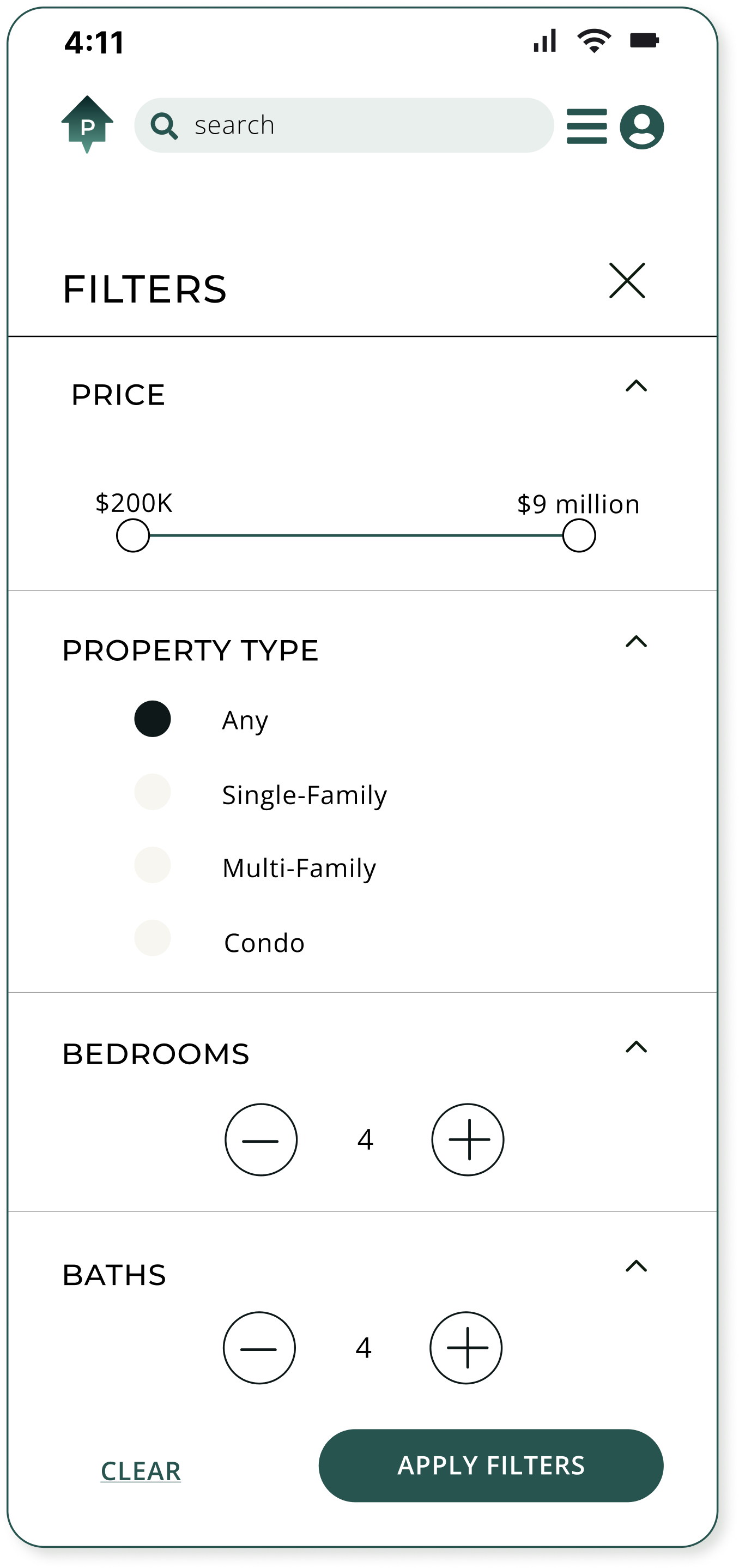
Filter page
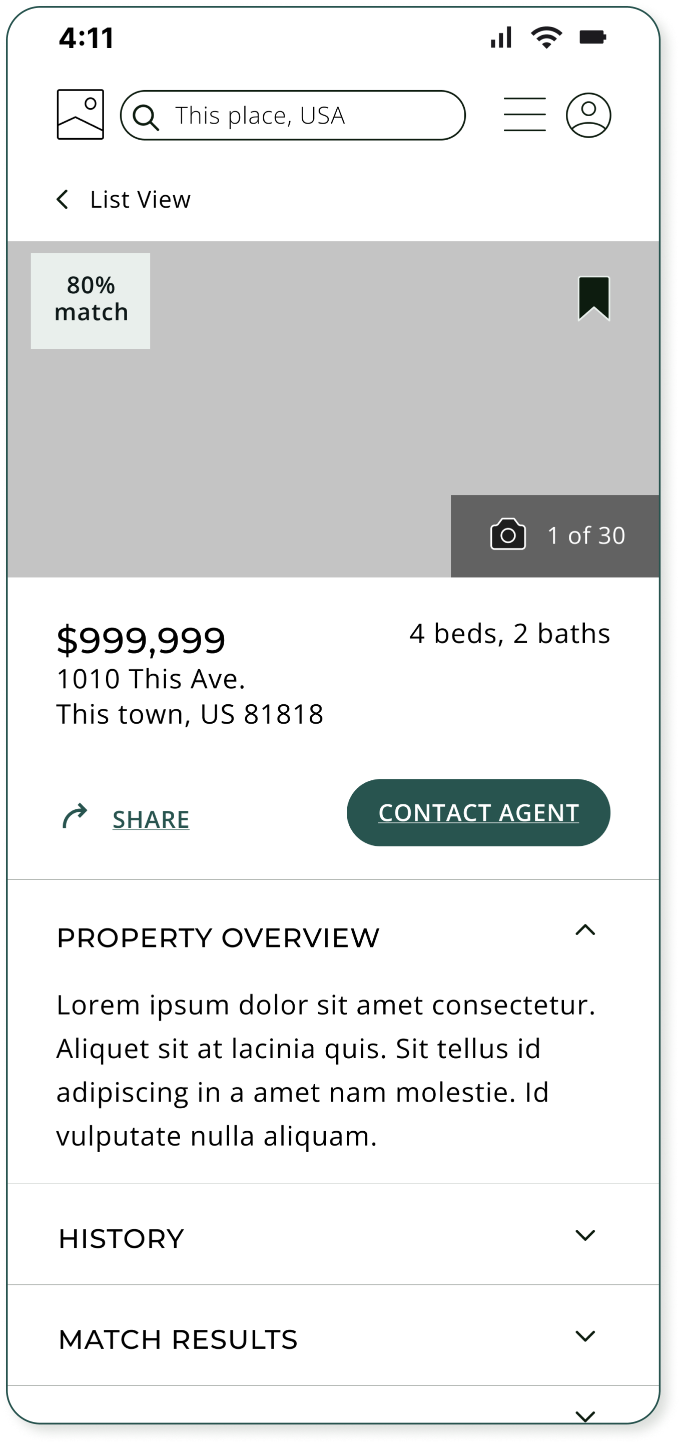
Property details page
Contact a real estate agent modal
Profile page

Challenge: keep it simple
As I started to add color and images to my design, I faced a challenge:
finding the right balance between providing a lot of information and keeping the app clean and easy to use.
In the beginning, my designs relied too heavily on lines to separate information, and I realized that the lack of color made the design feel unfinished.
I experimented with some more colorful UI patterns to help liven up the design, while still keeping the palette clean and monotone.
Eventually, I found a sweet spot between keeping things simple and creating an aesthetically pleasing design.
Screens Before
The challenge was to find places to add color beyond the CTAs and small splashes of green to give the app a more interesting and polished look.
Adding shades of green to UI Patterns


Creating visual harmony
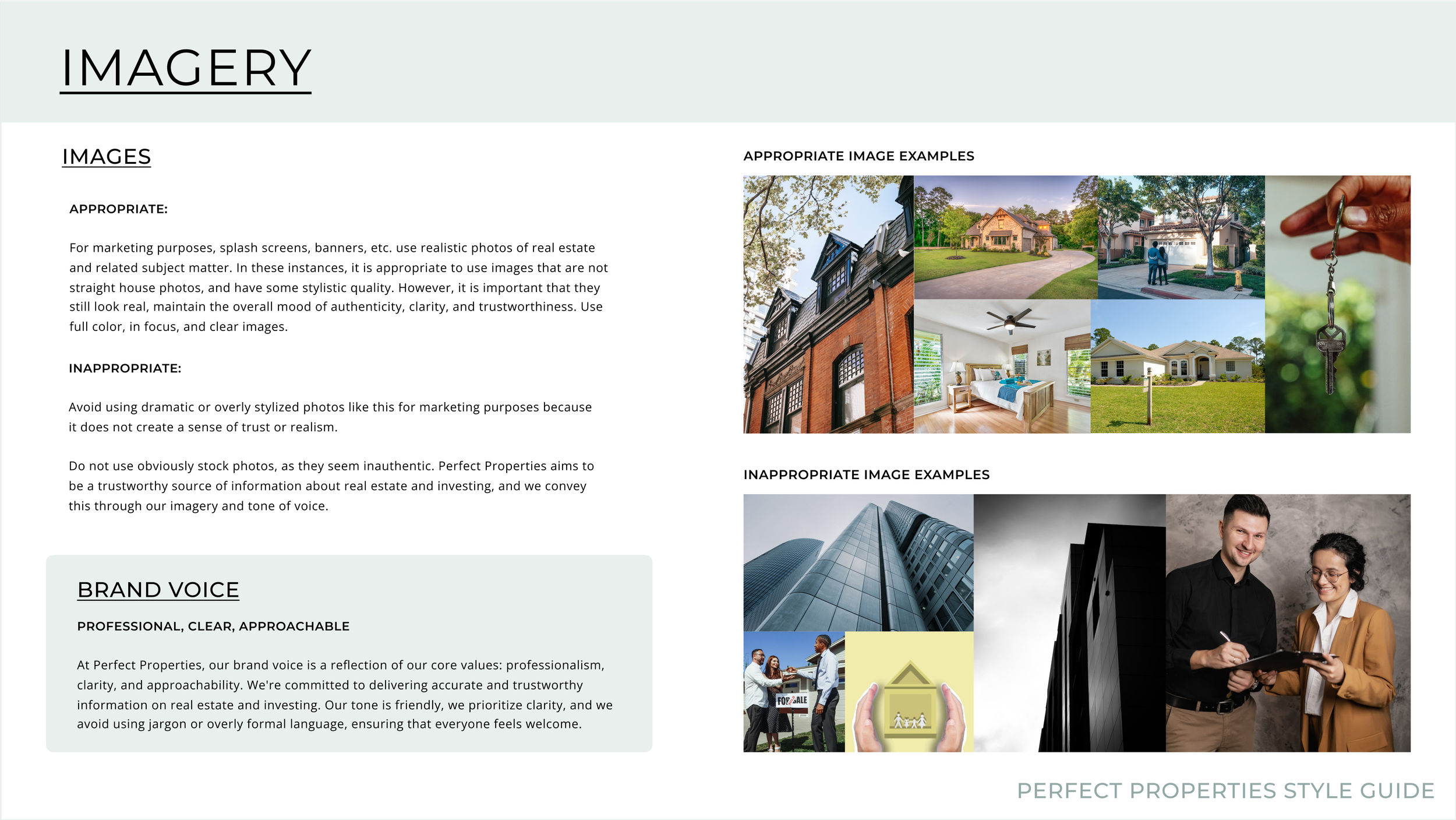
Using my mood board for inspiration, I developed a detailed style guide to outline the colors, logos, typography, imagery, and iconography.
The main color is an Evergreen shade, which conveys stability, growth, and financial prosperity; all of which are goals for the Perfect Properties user.
The overall use of color is minimal to maintain a sense of sophistication and clarity.

Final Designs & PRototype

Watch the video below to see Perfect Properties in action

Responsive Design
Designing for Tablet and Desktop breakpoints:
Users like Rashida will want to access Perfect Properties on the go, or on any device they have at their fingertips. Therefore it’s important to establish grids for these breakpoints, even though this is a mobile-first design. Take a look at the screens:

Reflection
There is such a thing as ‘too simple’
The emphasis on simplicity should be on the user experience, not necessarily the design. My initial design was too simple, to the point of being uninteresting, which in a way, affects the usability of a product. In other words, usability can be enhanced with color and the addition of interesting UI elements. I realized I could make bigger design choices without compromising the simplicity of the aesthetics.
Create a style guide and component library to make the design process more efficient
With this project, I really learned the value of organization. By having all of my elements designed and organized in a library, it was very easy to grab what I needed to remain on brand. The component library grew as I needed variants (such as different sizes), and it was crucial to have all of those elements easily accessible to build from.
Design for different breakpoints
Designing for different breakpoints is important for providing a consistent, user-friendly experience across various devices and screen sizes. This is the first project where I really took this job to heart. In the real world, users access content on a variety of devices, and the designer should consider these use cases when creating their screens.

Thank You!
PREVIOUS: E-Commerce
NEXT: Banking App


